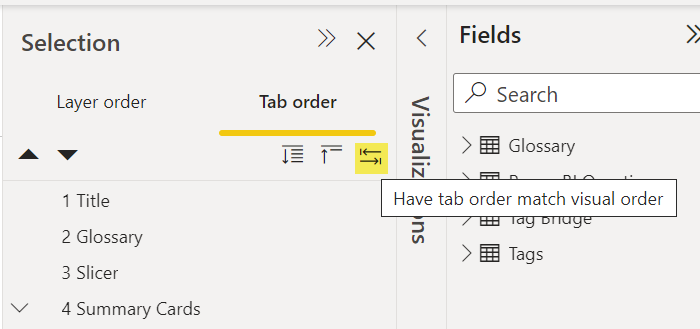
If you’ve visited the Tab order area of the Selection Pane in Power BI in the last couple of months, you might have noticed some new buttons.
The hover text on the first button says “Expand All”. This button is useful if you have grouped visuals. Groups are indicated by a carat to the left of the item in the tab order list.
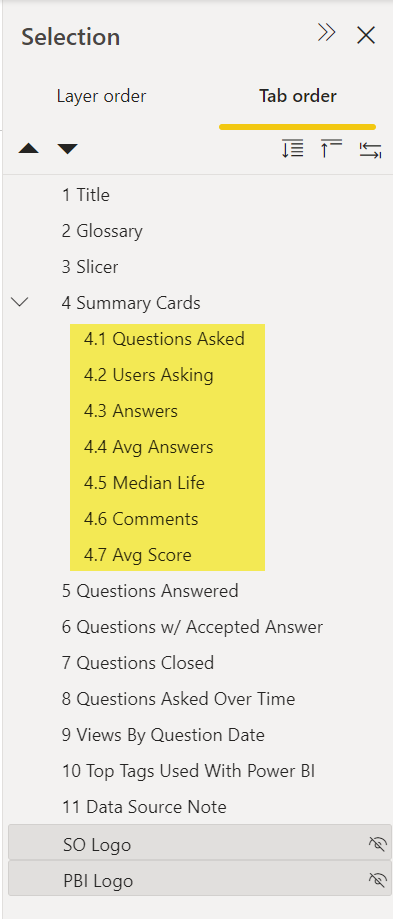
Selecting the Expand all button shows the individual objects within a group.
The second button is the Collapse All button. It will collapse the groups so only the name of the group is shown and not the individual objects within the group.
The third button is a great new addition: Have tab order match visual order.

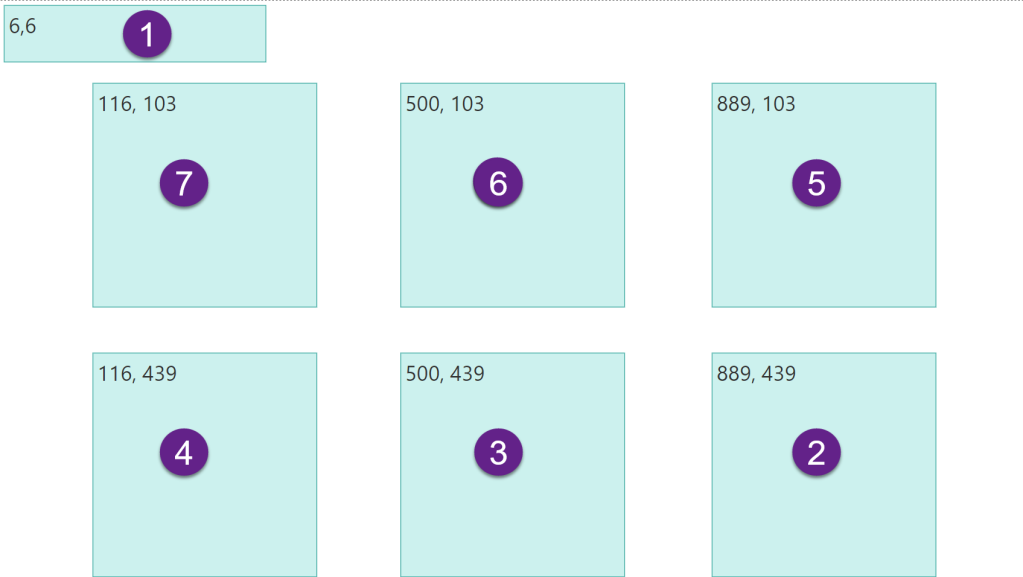
This button will set the tab order for the visuals on the page to sort ascending by Y and then X coordinates. Let’s look at an example.
I have a report page containing 7 textboxes.

After clicking the button to have tab order match visual order, the tab order is changed shown below.

This is often the correct tab order that matches how we read the report visually. This little button can increase keyboard/screen reader accessibility in one second instead of taking a couple of minutes per page.
There will be times that this tab order will not be what you want. Some exceptions might be when you use visuals that have a different amount of space inside the visual container, so the containers are intentionally misaligned (according to the X,Y coordinates) in order for the content to appear visually aligned. Then you might need to customize your tab order a bit. Another exception might be if you have some buttons or links at the top right of the report page that you want a user to visit last (after the content of the report). In that case, you would customize your tab order to make the button last.
But the majority of the time, this option to make tab order match visual order is exactly what you need. I applaud the Power BI team for taking this step to make creating accessible reports a little easier.


