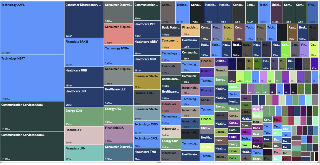
I recently created a treemap in Power BI for a Workout Wednesday challenge. Originally, I had set out to make a different treemap, but I ran into some limitations with the visual. I ended up with the treemap below, which isn’t bad, but it made me realize that the treemap is in need of some improvements to make it really useful. So I decided to share my thoughts here.

Performance
The treemap above takes a long time to render. I populated the treemap with one field in Category, one in Details, one in Values, and four fields in Tooltips. The fields all come from an imported dataset containing a single table with 239 rows. I’m running the latest version of Power BI Desktop (July 2023) on a machine with an Intel Core i9-11900H processor (8 cores/16 threads, 2.5 GHz clock speed) and 64 GB of RAM. This is likely more than the average Power BI Desktop user has available to them.
Changing the color of one category in the format pane consistently requires a wait time of about 14 seconds for me before the treemap finishes re-rendering.
If I use Performance Analyzer to capture this action, we can see the last category color change took 15463 milliseconds (15 seconds), and almost all of that time was spent on visual display.

This seems to be related to the presence of the tooltip fields. If I remove all the tooltip fields, it takes between 1 and 2 seconds, which is much more acceptable.
Category Hierarchies and Drilldown
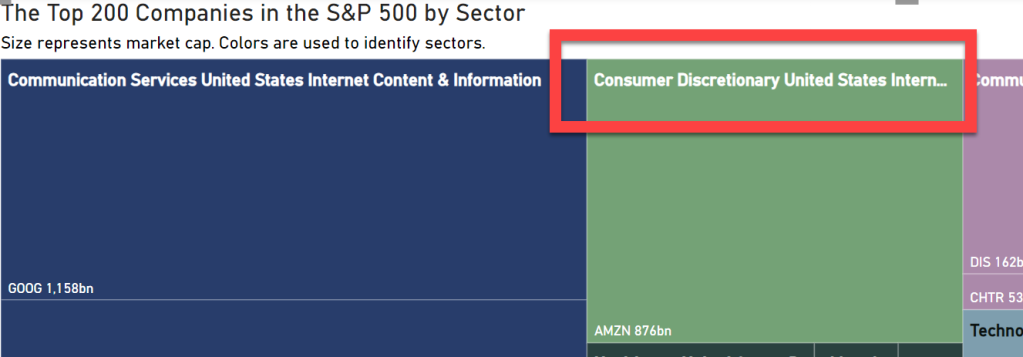
Power BI allows us to include multiple categories and the ability drill up/down though them. This is good because treemaps are really meant for large amounts of hierarchical data. If you drill down from the top level, it will concatenate the category names. For example, if my top level is sector and my second level is country, and I choose to expand all down one level in the hierarchy, I will see a value like “Technology United States”. While that is a good start, it would be great to include some kind of delimiter in there so it’s easier to read; e.g., “Technology | United States” or “Technology ↳ United States”. The other problem with drilldown and category labels is that they get truncated when they hit the edge of the category, and there is no way to have it wrap to a new line or even just make the text for that category smaller to fit without changing all category labels to be smaller.

The more important feature for me is to be able to see multiple levels of the category at once, instead of treating them like all one level when you drill down. In Power BI today, when you expand down through multiple levels of the category hierarchy, you just get more colors (1 color per combination of values in the categories). That gets messy pretty quickly. I want to be able to make something like Figure 1 in this blog post.
Part of what makes that tree map work is that there is more space/wider borders between the top-level categories. Currently, the Power BI treemap doesn’t provide me with any control over the borders around categories. I want to be able to make the border around categories thicker and change the color. The color is important for accessibility. I need to be able to create good contrast between the rectangle background color, the category border, and the visual background, so it’s clear where a category ends. Maybe that can be accomplished with border width alone, but being able to change colors would be nice.
It would also be great to be able to label the top-level category outside of the rectangles, as is shown in this treemap.
Details and Labels
The other big feature I think we need is better control over the detail labels. We recently (May 2023) got the ability to create measure-driven data labels in some visuals such as bar, column, and line charts. I’d like to see that added to treemaps as well. What’s currently missing from measure-driven data labels is the ability to add line breaks. I think line breaks would help with fitting information into the rectangles.
It would also be nice to be able to control the border color and width around the detail rectangles as well. Right now we can’t change the rectangle borders in the chart, and it can make the rectangles hard to see depending on the color used and the chart background color.
As with categories, it would be nice to be able to allow the detail labels size to grow/shrink with the size of the rectangle.
Colors
Currently, the Power BI treemap allows conditional formatting of colors only if you don’t have any fields in the Details field well. In my treemap, I wanted to see the individual stocks grouped by sector. The only way to accomplish that was to put the stock symbol in the Details. If I put both sector and stock symbol in the categories and expand all the categories down one level, I can see the sector title and the individual rectangles per stock, but the stocks are no longer grouped by sector. The stocks related to technology are not placed next to each other in the treemap. So while I can implement conditional formatting to color all technology stocks the same color, I lose the ability to locate all technology stocks together.

The inability to use conditional formatting on treemap colors when I have a field in the Details also means I cannot use proximity/location to encode the category and use color to encode another attribute or measure. That is what is done in the finviz treemap: they group stocks by sector and use size to indicate market cap, but the color is used to indicate stock price change over time.
Other Visual Improvements
Right now, I think the the limitations of the treemap visual keep it from being really useful. But I am excited to see the visualization improvements to other core visuals become available after months (years?) of stagnation. If you’d like to learn more about the planned improvements for core visuals, you can check out this AMA with Miguel Myers (PM at Microsoft who has set a new vision for core visuals in Power BI). You may also want to keep an eye on the PBI Core Visuals posts on LinkedIn. These planned improvements are, in my opinion, rightfully a higher priority than fixing the treemap.
Once the more general improvements across visuals are made (some of which may effect the treemap along with other visuals) and the most commonly used visuals (line charts and bar charts) are updated, I hope to see some of my requested improvements to the treemap visual.
Share Your Thoughts
What would you add to my list of treemap improvements? Are there any other enhancements you’d like to see? Do you know any cool tricks or workarounds for treemaps? Please share your thoughts in the comments below.
