 This month’s T-SQL Tuesday is hosted by Malathi Mahadevan (@SqlMal). The topic is to pick one thing I would like to learn that is not SQL Server.
I’m going to go a different direction than I think most people will. I spend a lot of time learning new technologies in Azure, but I am also focusing on learning better presentation skills and improving my use of related technologies. Yes, that often means PowerPoint. But sometimes I do presentations directly in Power BI when I am presenting data or mostly doing demos. Building presentations requires tech, design, and speaking skills. And I enjoy that mix.
I enjoy presenting at user groups and conferences, and lately I’ve been branching out in the types of presentations I give. At PASS Summit this year, I delivered a pre-con and a general session, and I participated in a panel and the BI Power Hour. Each one required a slightly different presentation style.
Just like we may cringe when we go back and look at old code and wonder what we were thinking, I have the same reaction when I go back and look at old presentations.
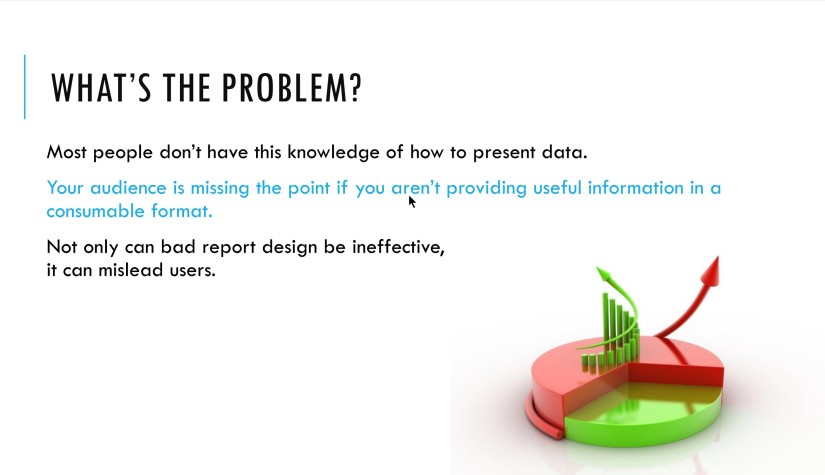
As a data viz person, you would think I would be better at building engaging presentations since a lot of the data viz concepts apply to visual presentation, but it’s still a struggle and a constant endeavor to improve. I have made some progress to date. Below is a sample from a presentation on good report design practices in SSRS that I gave in 2015.

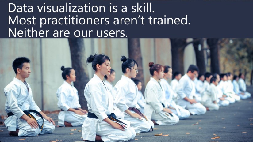
While it’s not the worst slide I’ve ever seen, it’s definitely not the best. Here are a few slides from my PASS Summit presentation called “Do Your Data Visualizations Need A Makeover?”, which cover the same topic as the above slide.


The new slides are much more pleasant and engaging. I have changed to this style based upon what I have learned so far from Echo Rivera’s blog and her Countdown to Stellar Slides program. I use more and larger images and less text on each slide. This naturally leads to having more slides, but I spend less time on each one. And there is less of a chance that I will revert to just reading from a slide since there is just less text. I get to tell you about what that one sentence means to me.
My goals is to learn how to deliver presentations that are more accessible and more engaging.
I blogged about accessible slide templates earlier this year. I got interested in accessibility when I was learning how to make more accessible Power BI reports. I want people to feel welcome and get something out of my talks, even if they have visual, auditory, or information processing challenges. So far, what I have learned is that I can be more inclusive with a handful of small changes.
To continue my learning about presentation delivery, I plan to:
- Take Echo’s Blast Off To Stellar Slides
- Read the Better Presentations Book
- Take a few PowerPoint classes on LinkedIn Learning
And of course, I plan to give presentations so I can try out what I learn and improve from there. I have already submitted to SQLSaturday Colorado Springs, and I’m sure I will add more presentations next year.
If you have resources that have been particularly helpful in improving your presentation delivery, please leave them in the comments.
Happy T-SQL Tuesday!

